Client: Elmer’s Restaurants
Elmer’s Restaurant, a Pacific Northwest-based company, realized that their core target audience was dwindling due to advancing age. The chain of restaurants wanted to update its brand to attract a younger, family-friendly audience in order to ensure a reliable market of customers in future years. Click each image for a closer look, click outside the image to return.
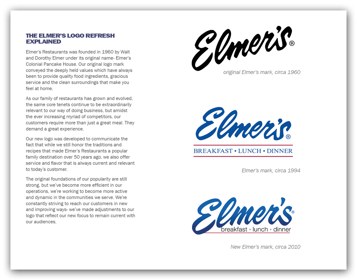
Restaurant logo update
One of the first elements of the Elmer’s brand refresh was to streamline and update the logo. There was significant equity in the previous iterations of the logo with their important “older” audiences, so the new mark was to be evolutionary rather than revolutionary. Elmer’s management was averse to leveraging an intentional nostalgic approach because they wished to move away from the overt notion that their recipes were “stuck in the past.”
My role: Logo refinement based on customer profile.
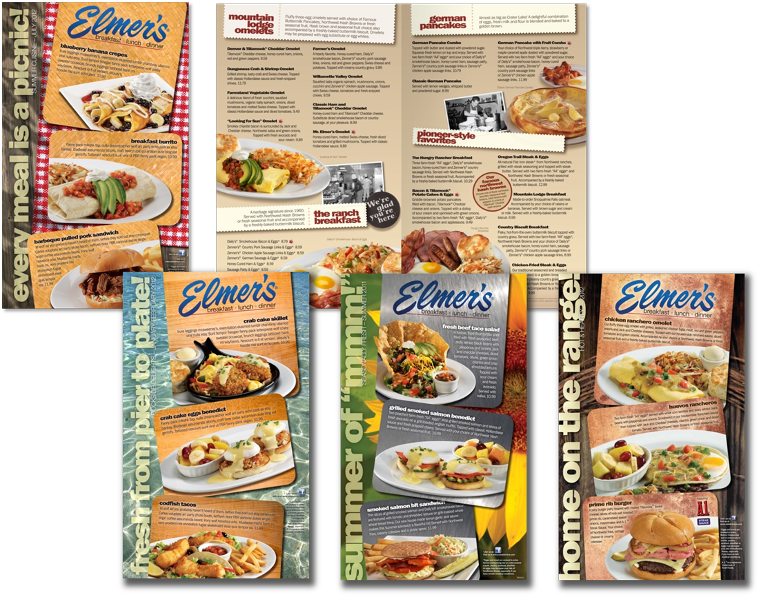
Menu redesign/update
The bulk of the brand overhaul for Elmer’s was developed in the menu design. I revised the official font sets for their modern appeal and ease of legibility. Elmer’s management admired how some of their competitors in the casual dining category used a product depiction approach toward their menus. With this in mind, we decided to show only consistent, staple dishes within the menu interior while also leveraging vintage accent photography to reflect their home grown origins as a differentiator from national chain competitors. Food specials were presented on easily changed menu covers that featured seasonal motifs to support cohesive themes across multiple in-store materials.
My role: Visual concept development, headline development, art direction & layout based on usability data, image editing.
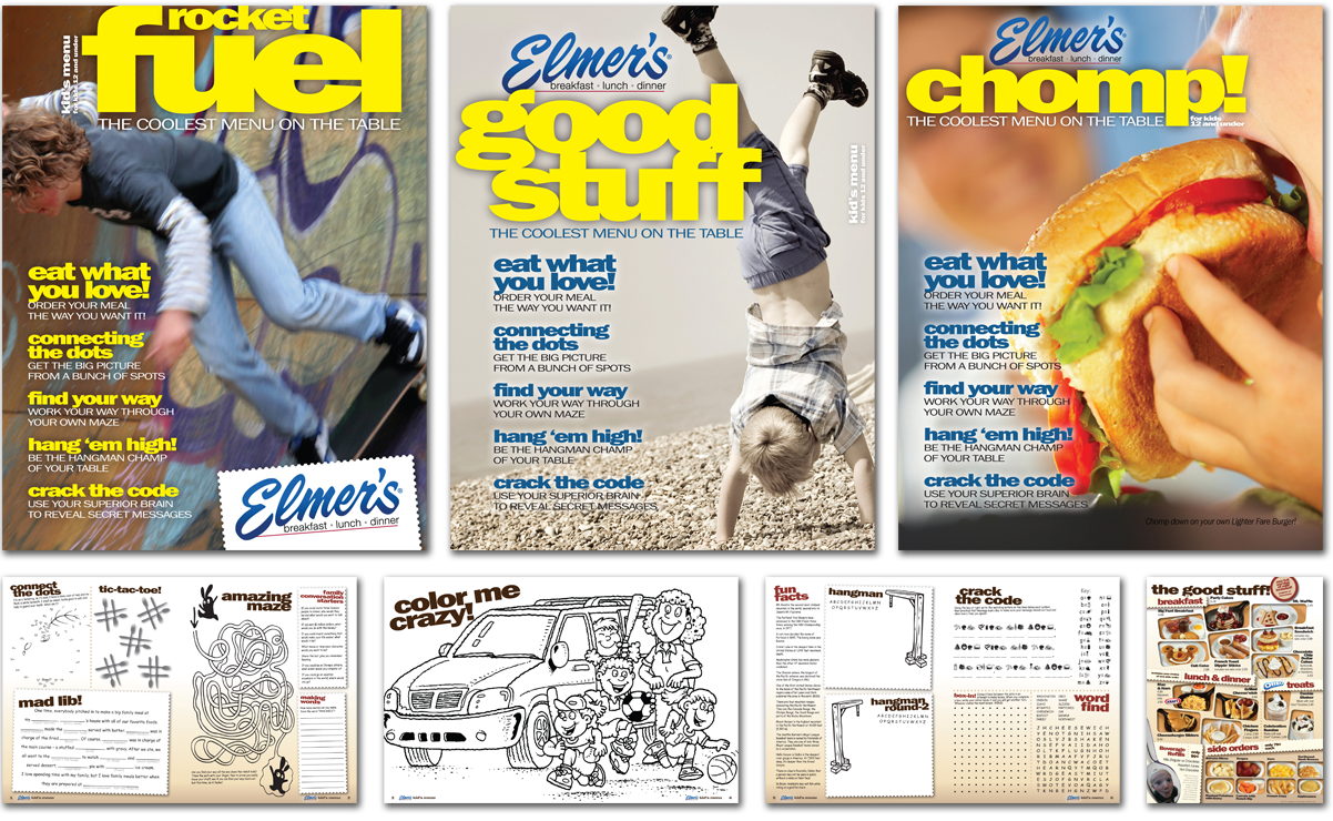
Shortly after developing the primary menu system, I proposed that they consider a magazine-style children’s menu as an effort to invite young customers into their fan base. Multiple covers provided some variation in the kids’ experience from visit-to-visit. The variety of dishes specifically developed for children was fairly limited, and since kids are much more susceptible to boredom (freshly-prepared food takes time to prepare and serve) we wanted to occupy them with activities to minimize that perception of time and make them feel like an important customer segment.
My role: Visual concept development, UX, copy writing, art direction & layout, image editing, print production prep.
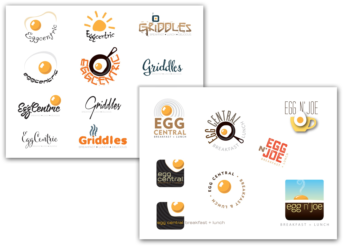
Concept restaurant identity
As a part of the process of naming their new concept restaurant, Elmer’s asked me to develop logo options for a number of entity names with the same basic mission: stylish breakfast. Since the first edition of this boutique eatery was to be launched in trendy Los Angeles, they were looking for ideas that were a little more free-form than their traditional “Elmer’s” livery.
My role: Logo concept development, art direction.
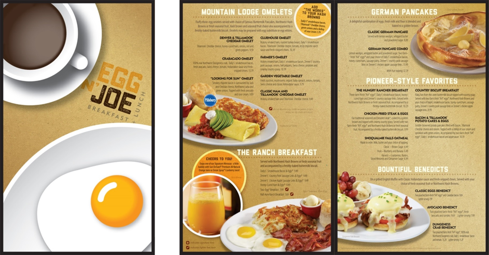
Rather than develop a specific brand guide to direct other future efforts for the new restaurant chain, Elmer’s decided to leverage the menu design as an example of the broader visual voice which they would apply to other communication elements utilizing their own in-house design staff.
My role: Visual concept development, UX, art direction & layout, illustration, image editing.
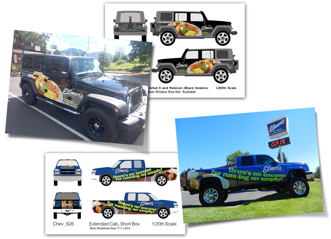
Vehicle wraps
In many of the municipalities in which Elmer’s operates, local codes severely restrict promotional signage options, so we developed a series of vehicle wrap applications to park strategically in order to enhance drop-in sales.
My role: Visual concept development, copy writing, art direction & layout, image editing, production file development.
