Client: Adventist Health System
Adventist Health System is the largest not-for-profit healthcare provider in the United States with more than 80,000 skilled and compassionate caregivers in 44 hospital campuses and hundreds of care sites in diverse markets throughout eleven states. Click any image for a closer look, click outside the image to return.
New Logo
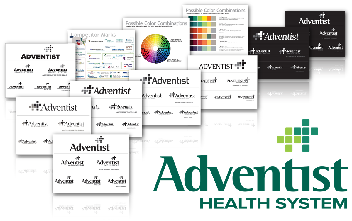
In July of 2014, we at Kennedy Global were engaged to begin exploration of a new brand for Adventist Health System. While they desired a fresh new look, one of their principle requirements was to retain iconography that would still provide strong reference their faith-based missions.
Ultimately, guided by competitor studies and focus group results, we stayed with their previous “modular dual-cross grid” icon, and revised the wordmark in favor of a strongly structured letterform with a slightly softer and more approachable tone. The color palette was chosen for it’s vibrancy, intensity, and clear connection with health and growth.
My role: Competitive brand research, color research studies, customer research analysis, logotype development, iteration presentation development.
It’s important to note that the “new” Adventist Health System brand shown here has been superseded by yet another update of the brand look which I also developed- keep scrolling to the bottom of this page to see the new logo.
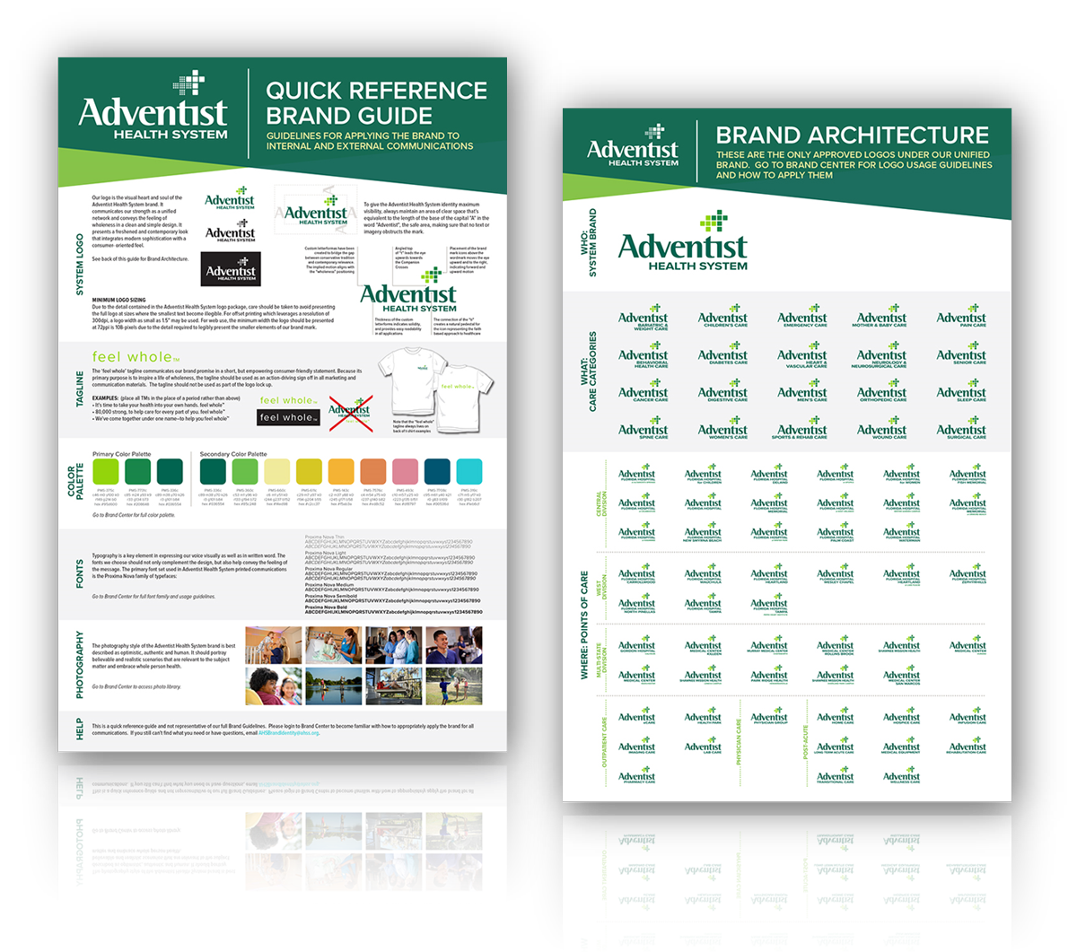
New Brand Quick Reference Guide
Vital to any brand to assure consistency and continuity, we also provided several sources for branding guideline references ahead of the formal brand guide. A semi-comprehensive set of guidelines presented on Adventist Health Systems’ intranet site that included specifications on every iteration of the brand mark, but also guidelines on writing styles, visual voice, signage, legal issues and much more.
The medium-format quick reference guide shown was intended to be distributed to every one of Adventist Health System’s many media partners for instant access to some of the most basic core requirements for reproducing the brand mark until the comprehensive brand guide could be produced.
My role: Ideation, visual application development and specification, art direction.
Visual Center Exploration Options
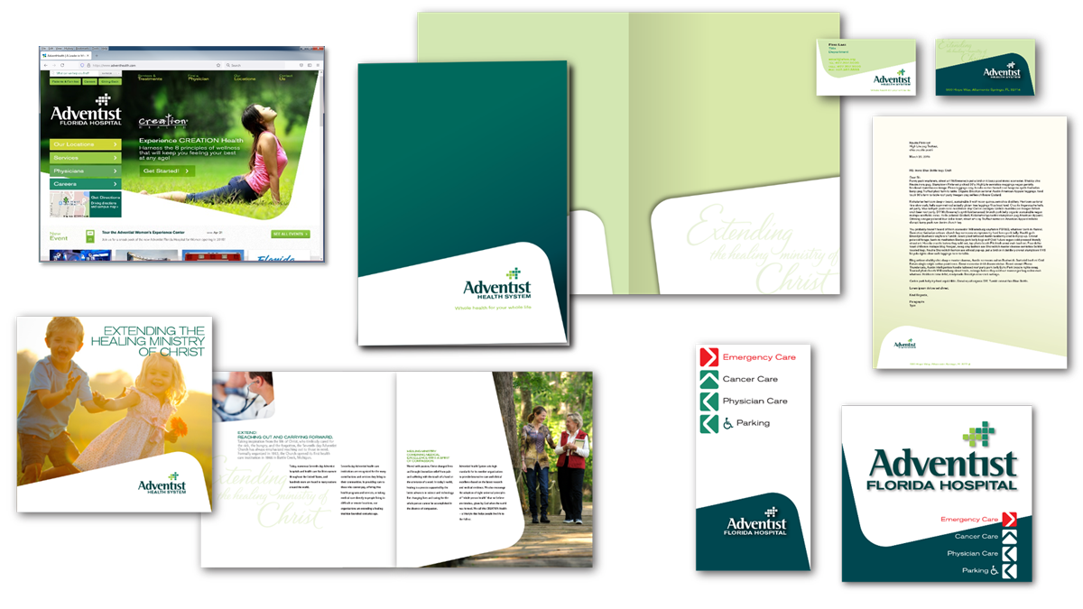
I created the “Angled Box” concept to provide a strong reference to the individual components of the Adventist Health System identity, but did so in a fresh, simple and dynamic way. Every scene leveraged but one primary reminder of the logomark system to reveal the message of the moment, but that single element is powerful and unique among Adventist Health System competitors.
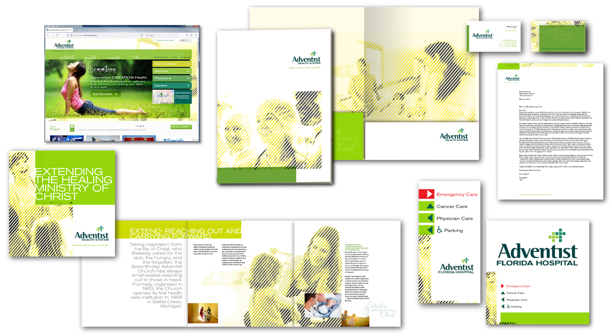
The primary purpose of Adventist Health System is to help make and keep people whole and healthy. The “Lined” visual center concept I developed keeps the human side of the health care business at the forefront of every communication vehicle presented. This concept also helps to present messages in a clean, organized fashion that never looks static or regimented, but always vibrant, organic and dynamic. Background imagery always depicts people helping others: to grow, to be whole and to stay whole.

Additional studies explored the new identity in other less mainstream applications such as access badges, “scrubs” and others to demonstrate identity suitability.
My role: visual concept development, art direction, layout, image editing, approval presentations.
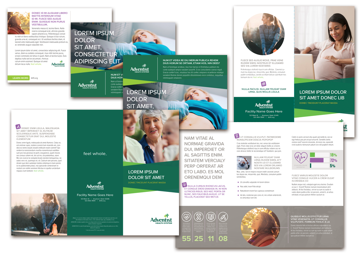
Collateral Template Suite
The “winning” iteration of the new Adventist Health System collateral system leveraged bold colors and simple geometric shapes to convey a modern, easy, seamless representation of the consumer experience.
The basic template set consisted of eight different formats of their most used collateral material needs from postcards and brochures to patient guides, folio folders and large-format posters. Every InDesign template also included clear instruction call-outs on non-printing layers for easy use “in the field”.
My role: Ideation, visual concept development, art direction, layout, image editing.
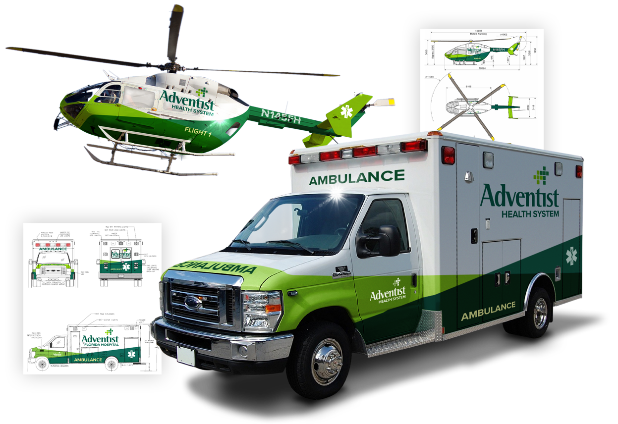
Vehicle Template Examples
The accent elements of the accepted new brand worked particularly well to identify Adventist Health System vehicles in a public setting with the bright green coloration expressing urgency while proudly announcing the organization behind their effort. Other studies included small economy delivery cars, large panel vans and even semi-trucks.
My role: Ideation, visual concept development, art direction, layout, image editing.
Updated Advent Health Logo Development
Just as we were about to launch the new Adventist Health System brand to the world, the CEO of Adventist Health System retired and new leadership was welcomed to the organization. Understandably, the incoming administration brought some new ideas into the conversation and the decision was made to pause with the rebrand.
After some additional market studies and focus groups were convened, the decision was made to re-name and re-imagine what the brand could be just as our retainer with Adventist Health Systems was coming to an end. It was decided that numerous agencies would re-submit multiple concepts (with rationale) for additional market and focus-group testing. The top two rows shown here were presented as alternate approaches. But in the end, the logo we had worked for several years to develop would be replaced… with a new logo which I developed!
My role: Visual concept/logo mark development, art direction.
